


White Paper - Pantone Color Alignment
WHITE PAPER – PANTONE COLOR ALIGNMENT
Challenge: Variations in Print
May 15, 2018
There are many normal printing industry variables that, even with extremely small changes, can contribute to color appearance changes from print run to print run such as: paper composition and absorption, inks (formulation accuracy, pigment source, viscosity, and drying conditions), print variation due to ink metering, production speed, and environmental factors. These can lead to realized variation in printed color lightness, hue, and chroma. In particular, small changes in hue can have noticeable visual differences due to our innate human sensitivity to hue changes.

Pantone prints its guides using possibly the world’s only 28-fountain offset printing press designed specifically for printing Pantone guides and books. Like most sophisticated printing systems, it takes a well-trained, highly-capable team to run and manage its complexities. We are proud to have such skilled professionals working at Pantone. However, the reality of any printing processes is that, even when stringently managed and controlled, the operation isn’t easy or perfect.
Solution: The Latest, Advanced X-Rite Technology
Within our culture of continuous improvement, Pantone has now been able to embrace new tools and processes to enhance and better sustain our printing. Thanks to PantoneLIVE, X-Rite product sophistication and adaptability, and industry experts with the ability to harness the latest, advanced X-Rite technology, we are pleased to release a more colour-critical and exciting Formula Guide than ever before!
With our enhanced products you will appreciate:
- Better overall printed quality
- Tighter tolerances – 90% at a 2ΔE2000 or lower. (Formula Guide Coated)
- Colors better visually aligned to the 2010 Pantone Master Standards
- More tightly controlled, sustainable consistency with every production run
With this new ability to better standardize our production time over time, we can minimize color variation from guide to guide more than ever before.
Details: Products Identified
The full adoption of the latest X-Rite hardware and software, including ColorCert 3.0, InkFormulation Software (IFS), ColorCert ScoreCard Server, eXact Scan, and PantoneLIVE, has provided Pantone with a successful combination of ink and printing enhancements finally compatible to its unique printer infrastructure and ecosystem. These tools enable Pantone to not only refine its ink mixing and printing techniques, but also control, standardize, and maintain output from print run to print run.
Details: Why Were These Particular X-Rite Solutions Chosen?
ColorCert 3.0 Press Process Control Software –
ColorCert 3.0 helps printers and converters ensure accurate, repeatable colour, from job to job. The complexity of maintaining color and print quality is challenging – especially considering Pantone’s own unique 28-fountain press, our specifications, requirements and unavoidable variables. We are striving to ensure color appropriately matches our Master Standard digital data as closely as possible each time we print, in order to increase user confidence in the Pantone Formula Guide Coated and to deliver optimal product utility.
ColorCert 3.0 allows:
- Creation of print specifications
- Measurement and certification of proofs
- Print process control on press, in real time
- Ability to guide density adjustments to improve color matches (BestMatch)
- Ink room quality assurance and direct connectivity with InkFormulation Software (IFS), sending measurements taken on press to the ink room for evaluation and reformulation if an ink adjustment is necessary
What ColorCert 3.0 provides for Pantone:
- The first version capable of measuring all 28 colors across the entire sheet printed with Pantone’s unique press
- Specific customization of patch definition and allows unique patch skipping, so measurements can be quickly and efficiently scanned in one action across the press form, providing immediate feedback to the operator
- Best optimized IFS results by providing color correction data to the ink kitchen directly from the press so exact ink adjustments can be made quickly
InkFormulation Software (IFS) –
X-Rite InkFormulation Software (IFS) uses PantoneLIVE “digital DNA” to quickly generate a Colour Match through three easy steps of project detail specification: 1) target colour 2) substrate and 3) ink bases. IFS also helps minimize ink irregularities and variances by recognizing and adjusting for them, giving flexibility and control over recipes and assortments, improving basic material handling, simplifying definition of the right ink film thickness, and helping reduce waste via quicker matches to “digital DNA” using less ink and downtime. It also makes it easier to use leftover inks and press returns, reducing overall ink inventories.
What IFS Provides for Pantone:
- Communication directly with both PantoneLIVE and ColorCert
- Formulation of ink to achieve results within a tolerance of 1∆E2000, and can recommend adjustments if printed results shift due to process variables
- Recipes sent directly to the dispenser
- Improved overall quality and efficiency by linking InkFormulation Software with ColorCert 3.0 quality control
- Better tools to compensate for changes in base ink strength and/or substrate color
- More efficient digital data workflow in order to standardize to tighter tolerances
- Minimized potential for human error while assisting skilled technicians in streamlining their workflow to achieve better colors faster
ColorCert Scorecard Server –
ColorCert Scorecard Server offers a convenient dashboard that allows for evaluation and monitoring of the print production workflow. By combining scorecard reporting and statistical process control, it allows real-time access to performance on press regardless of geographic location. At any time, an operator can view a summary of overall quality levels using customizable filters based on plant, machine, customer, work type, or other job parameters and then choose to dig deeper into problem areas for efficient exception management.
With the ColorCert Scorecard server, simply create an agreed-upon specification including color standards, dot gain, and tolerances. It returns one number that reflects the level of compliance with that specification. The ColorCert dynamic scoring algorithm is directly based on individual targets and tolerances, and reports how well they were achieved rather than artificial weighting used by other solutions that can distract operators, inadvertently placing focus on less important metrics.
What ColorCert Scorecard Server provides for Pantone:
- Tracking of each of Pantone’s 2678 different Pantone Matching System® colors by job, by form, and by color location, so issues can be identified easily and countermeasures quickly addressed if necessary
- Scorecard Server verifies each print run to track printing quality
- With Scorecard Server, real-time, accurate results are available within seconds of printing completion
- Scorecard Server maintains and tracks against the control standard, which ensures on-going printing quality, consistency, and reliability
eXact Scan Spectrophotometer –
The X-Rite eXact Scan is ideal for use in offset to improve on-press color control, reduce make-ready time and waste, and significantly improve color consistency. The eXact Scan gives operators the ability to quickly scan in a large number of patches. Wireless options allow operation flexibility and ease.
What eXact Scan Provides for Pantone:
- The ability to now measure a strip of patches in one movement across the full form, cutting out considerable time
- Improved color accuracy over previous instrumentation
- Compliance of instruments with the latest ISO standards for color measurement
PantoneLIVE Digital Color Libraries –
PantoneLIVE allows access to a secure, cloud-based repository of common Pantone Color Libraries and syncs with both IFS and ColorCert software packages. Every software and hardware solution component interacts with PantoneLIVE for digital standards.
Details – What Has Changed?
Guide and Book Printing Tolerances – Pantone can now proudly offer tighter tolerances (about 90% of colors are under 2ΔE2000*) with our printed publications. In fact, our soon-to-be-released press run is achieving even better tolerances, with many colors close to a 1.2 ΔE2000*. Also, in line with the printing industry, Pantone uses ΔE2000. While still not perfect, compared with older methods, the math of ∆E2000 is the state of the art in matching the way the human vision sees differences in color.
*Formula Guide Coated.
Industry Typical Press Run Tolerances - As noted, the formulas shown in our guides are starting points. Like most printers, Pantone understands that application of ink to paper requires flexibility in the exact ink recipe in order to compensate for variations that naturally occur in pigments, in ink bases, and in paper stocks, to name a few.
When preparing a press run, Pantone employs an exhaustive regime of testing, checking, and quality control of rigorous incoming material specifications, while also validating methods and tools to mitigate raw material variability. Although we pay a premium price for paper, base inks, and quality control equipment, these variables are reduced but are not always eliminated. Slight variations may still occur between printings, as well as during each printing. Within any given printing, this process variation can result in a visual or measured color change. During Pantone production runs, a representative number of samples are measured using a scanning spectrophotometer in order to provide high confidence in the overall print quality of the production run. Press operators follow the guidance of software to simultaneously adjust the level of all 28 ink fountains and maintain the smallest ∆E value possible. The goal is to achieve less than 2∆E2000 for all 28 colors on the page. This was chosen because 2ΔE2000 is one of the most common tolerances applied to printing branded spot colors and is reasonable variation when printing the breadth of colors specifically needed to be managed on a daily basis for each form.
Data for Continuous Improvement – With each and every press run, data is collected to provide visibility to opportunities for improvement. Due to our ability to get closer to our digital targets, we are reducing variances with every production run. Although perfection is very difficult to achieve, it is our ultimate goal to get as close as possible.. Some slight variances can still be occasionally expected as it is impossible to remove all normal printing inconsistencies that can contribute to color variation from book to book.
Controlled, Printed Color Appearance – Every graphic designer, whether color critical or just visually color inspired, can now enjoy more reliably controlled, sustainable printed color – from run to run, books to guides. Press operators and ink suppliers also benefit from these improvements in book-to-book consistency. Better colorimetric matching aligns with better visual matching to our original 2010 Master Standards.
Master Standards are digital data points (spectral data, or a color’s DNA) that were determined and set at the initial printing of each Pantone Matching System® (PMS) Color when we relaunched that system in 2010. These Master Standards do not change and are based on the colors from our guides (like the 1,867 colors from the Pantone Formula Guide) on coated paper stock. Master Standards are developed considering only one type of substrate, printing method, and specific ink set, using specific press settings and methodologies.The data helps enable colour to be consistently reproduced according to its original intent, not only in the printed PANTONE publications.
Pantone’s Internal Printing Process Workflow – Pantone has been able to re-write our standard operating procedures for both our ink kitchen and our pressroom. Not only have we been able to reduce the chance for human error, but we’ve also built a process that can be more easily and quickly taught to others without dependency on high levels of technical experience in case unexpected changes happen to our current staff.
- Tighter tolerances on press can be achieved, because the X-Rite eXact instruments correlate better with the digital standards than the previous technology
- Operators can trust that the numbers match visual appearance better
- ColorCert’s BestMatch feature provides colour correction guidance to the operator to reduce ∆E as much as possible under the existing press conditions
- When the conditions do not allow for an acceptable match, the software will alert the operator that the ink needs to be corrected, and the measurement data can be sent directly to the ink kitchen to calculate adjustments
- Data that is collected during the run, and after ink dry-back, is recorded and reviewed frequently to provide insight on possible areas of improvement
Details – What Remains Unchanged?
Master Standard Digital Data - The Master Standard digital data is not changing. This data is our “color DNA” and has not changed since it was established in 2010. Pantone does not intend to change this data unless an uncontrollable element presents itself (such as a naturally occurring pigment becoming obsolete) that impedes further creation of that color. To date, we have not experienced any such situation and do not foresee any in the upcoming future.
Design Software Digital Data – Often, design software from Pantone and others like Adobe® use M2 data which is the “UV- Cut” or UV-Filtered measurement standard. This data is appropriate for the design process so that the colour is independent of influence of paper that has optical brighteners (OBAs).
Printed Formulas – The ink or process printing formulations in our print publications have not changed and are still valid for use as starting points to create and repeat colors. The minor noticeable changes in the updated guides and books are only in the visual representation to better align select colors to their original intent.
FAQs
When will products with advanced technology enhancements be available?
The production-enhanced Formula Guides and other publications for graphic design have already started shipping from pantone.com or through our international network of distributors.
What colors are affected by this change?
Because of the consistency improvements on some of the most challenging Solid Coated PMS colors, a few colors in the new Formula Guides and other publications for graphic design might look different when compared to previous versions. These changes are due to the reduction in the variation from the digital standard and from run to run. The visual representation within the publications has been improved, whereas the printed formulas associated with each color have not changed.
Are all Pantone Products affected?
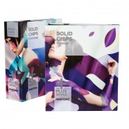
No, not all Pantone Products are affected. The changes in the updated Formula Guides are strictly a reduction in variation to better align colors in these publications to the Master Standard digital data, and reduction of variation on recurrent editions of the publications. Applying the new technology to our printing process will elevate the user experience when using our guide, book, and printed references by helping to better represent and standardize the consistency of visual appearance. These enhancements are specific to the Pantone Graphics System and will begin with the Formula Guides and Solid Chips Books, then rolled out to the remaining products within the Graphics System.
As Fashion, Home + Interiors products are produced using different processes, those systems will not be affected. To learn more about Pantone Color Systems, visit Pantone Color Systems Explained.
Does this mean that my existing Formula Guides are outdated and unusable?
None of the printed formulas are known to be inaccurate in previous guides and our Master Standard digital data has not changed since inception. However, it is possible that a few select colors in some guides visually appear different due to wider process variation based on variables in the printing process such as paper stock, base pigments, finished inks, press conditions and environmental conditions – all of which can contribute to inconsistency.
The printed formulas are intended as a guide and subject to normal printing conditions. Leveraging advanced X-Rite software and hardware technology, the updated guides reflect reduced color variation and improved color appearance across print runs. We recommend evaluating all color-critical decisions against the digital master standard data, accessible through PantoneLIVE or other Pantone-licensed software, in order to ensure the best possible color accuracy.
Products reflecting our new production enhancements are now available. Pantone recommends replacing guides and books every 12-18 months, as normal usage and exposure will render your colors inaccurate.
How does this affect my other Pantone Tools such as Chip Books, On-Demand Prints, etc.?
Applying new technology to our printing process not only improves the consistency and visual appearance of our guide and book colors, as well as their relativity to the Master Standard digital data, but it also improves your overall user experience. This means that the printed color will be more standardized throughout all Pantone Matching System® (PMS) products. For example, when a color is compared from a Pantone Guide to Pantone On-Demand Prints, they will not only align better with tighter tolerances, but the colors will look closer when possible – understanding that they are printed using different processes on different substrates, so some variance may still be noticeable.
These enhancements are specific to the Pantone Graphics System and will begin with the Formula Guides, and then applied to the remaining products within the Graphics System.
As Fashion, Home + Interiors products are produced using different processes, those systems will not be impacted. To learn more about Pantone Color Systems, visit Pantone Color Systems Explaineds.
Will this affect any colors in Pantone Plastic Standard Chips? Are those now outdated?
As most of the PMS Plastics were created using Master Standard digital data, the new technology enhancements to our printing process will reduce the variation in guide and book colors that may have varied more widely in the past. The result will be an improved match between the printed products and our Plastic Standard Chips.
How do I get Pantone Colors into Adobe Creative Cloud and what does it cost?
As of March 2018, Adobe Creative Cloud/Creative Suite tools come pre-loaded with Pantone Color Books. These books do not include new colors launched since 2012. Customers have three options for delivering the most up-to-date Pantone Colors into Adobe tools:
- Pantone Color Manager (€102.00 or US$99) – provide direct export of up-to-date Pantone Color Books to Adobe Illustrator, Adobe Photoshop, and Adobe InDesign
- Pantone Studio for iOS (US$4.99/month or US$29.99/year) – send Pantone Color Palettes from your mobile phone directly to your Adobe Creative Cloud account, or export .ASE files
- PantoneLIVE Design (US$99/year) – Two Pantone design apps connect Pantone Colors to Adobe. The ColorBook and Viewer Plugin for Adobe Illustrator integrates Pantone Master and PantoneLIVE Dependent Standards into Adobe Illustrator. In addition, PantoneLIVE Visualizer allows the export of Pantone .ASE files to any supported Adobe software.
Footnotes: Formula used: ΔE2000, D50/2˚, 45/0, M0, Munsell/PantoneLIVE Backing Material, eXact 4mm aperture, Net Profiler on.

 粤公网安备44030402000239号 |
  手机版
手机版 电脑版
电脑版